Perhaps no longer the biggest love in my life, but the longest has got to be bubble tea, or boba as some know it. There’s just something magical about the infinite flavour combinations you can bring together in a single cup, something I was sorely missing when I made the move to Monterey.
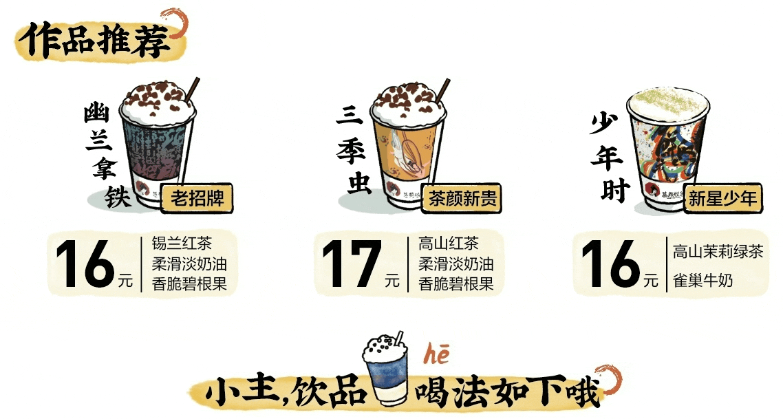
That’s why I decided to localize a visual from a popular bubble tea chain, in the hopes that one day it might decide to expand to the US. This is a visual from ChaYanYueSe 茶颜悦色 (or SexyTea, their official English name. More on that later.), a highly popular boba/milk tea shop brand in Hunan Province, China that exploded in popularity over the past few years. Its brand visuals are aligned with its focus on traditional Chinese flavors and ingredients.
They take the art of making tea very seriously, with the emphasis on high-quality ingredients and the handcrafted process by their tea baristas — such that the brand even has a guide on the different types of tea and how you should drink them.
This was really intriguing to me, and I felt that if one day, SexyTea were to expand to the English-speaking market, this would be a cool segue to teach new customers about their tea. Thus, I decided to localize this guide.

Initial Research & Considerations
In keeping with the brand’s emphasis on Chinese cultural elements, a few things that stand out in this visual include the brush-like font style in the headers, as well as the vertical text layout that is typical in many Chinese texts. I would also have to watch out for text expansion in the English translation for some of the smaller boxes.
Font Comparison
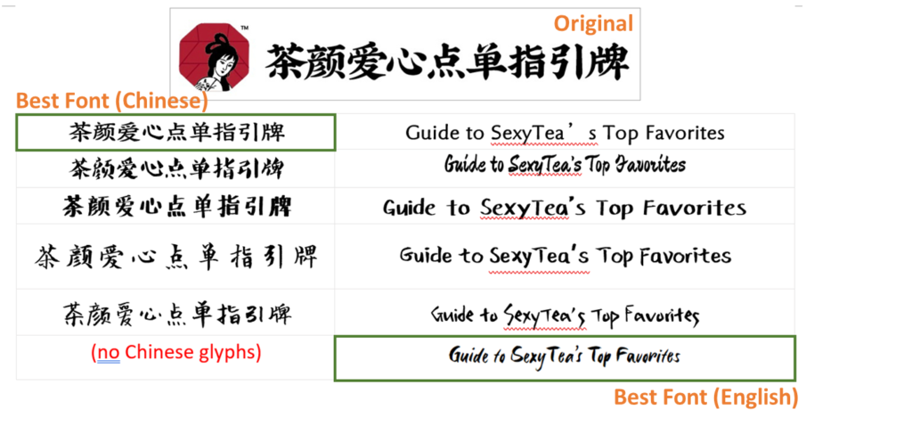
Before I could choose a suitable font in English, I wanted to see if I could identify the original font of the black header, or at least its font style, that was used in this visual. Its characteristics includes varying strokes and a brush-like elements on corners and ends.
I first tried to search for “Chinese calligraphy brush fonts” on Google, but my search didn’t produce amazing results (see the fonts I compared below). Most of the fonts seemed to be handwritten by amateur artists or enthusiasts, that while pretty, often had irregularities in its spacing, size or treatments.
Going back to the basics, I found this detailed post that explained some fundamentals of Chinese typography, including the different types of font styles. I realized that the header font was a Kai-Ti (楷体) style one, which helped me to narrow my search. Eventually, I was able to pick a Kai-Ti font that looked closest to the original. The only problem was, its English glyphs did not keep the same brush-like strokes at all. This was a problem in many Chinese fonts I examined.
Finally, I checked Adobe Fonts again before stumbling upon Six Hands, which has multiple fonts in the family including a Brush font. Bingo! I felt this was the closest to what I was looking for, with its strokes of varying thickness, but maintaining a professional, consistent look across all glyphs.
Common Layouts in English Visuals
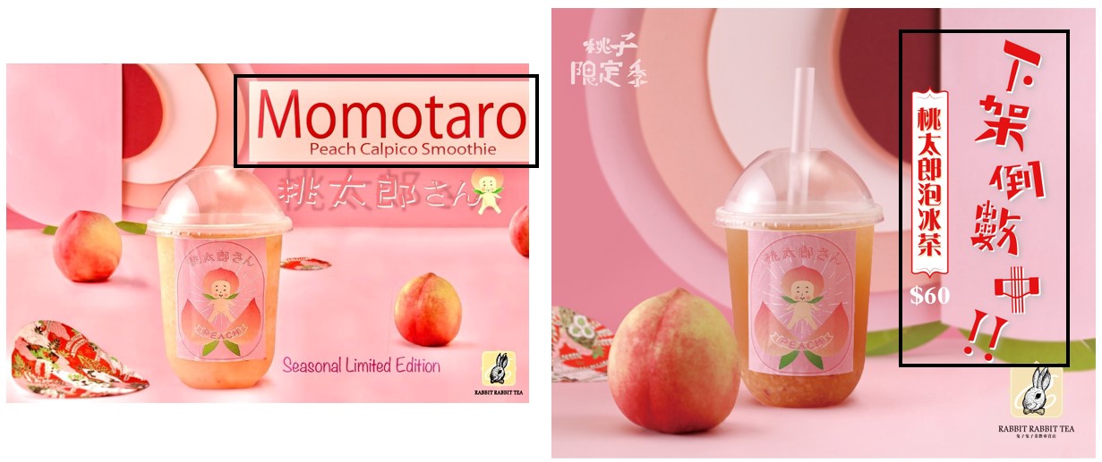
Although I had some ideas on the layout, I wanted to confirm it by doing research on the visuals created by actual bubble tea shops in Chinese vs English markets. And thus, I compared the visuals on the social media pages of Chinese brands who have entered the US/English market, like Gong Cha, CoCo Tea and Rabbit Rabbit Tea.
That’s how I found a pair of interesting visuals – these are two images from Facebook about the same peach-flavored drink, posted by Rabbit Rabbit Tea Taiwan and their outpost in California respectively.
As expected, the Chinese artwork went with a vertical layout (perhaps, because it aligns nicely with the cup edge) and the English artwork was a horizontal layout, confirming my initial thoughts.
Process
Here are the steps I took to localize this visual.
- Picture List
- Translations
- Hide text
- Insert English text
- Adjust text treatment / layouts
Picture List
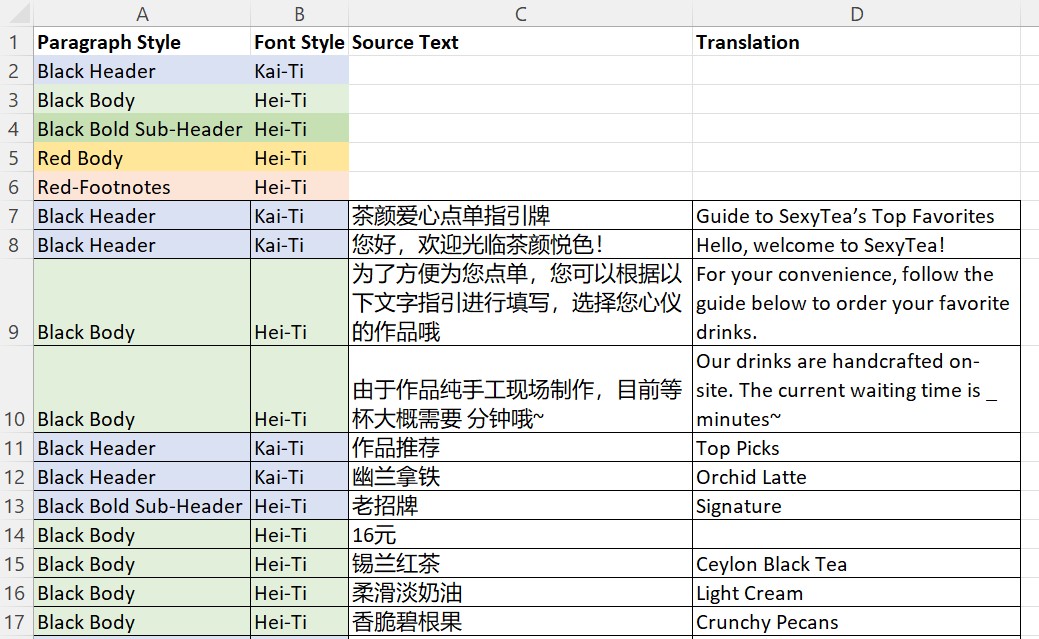
In order to better keep track of all the text on this page, I created a picture list in Excel with the source text, and assigned paragraph styles and fonts styles to each segment. These paragraph styles will correspond to the same paragraph styles I will later create in Illustrator. After that, I inserted the translations of each row.
Translations
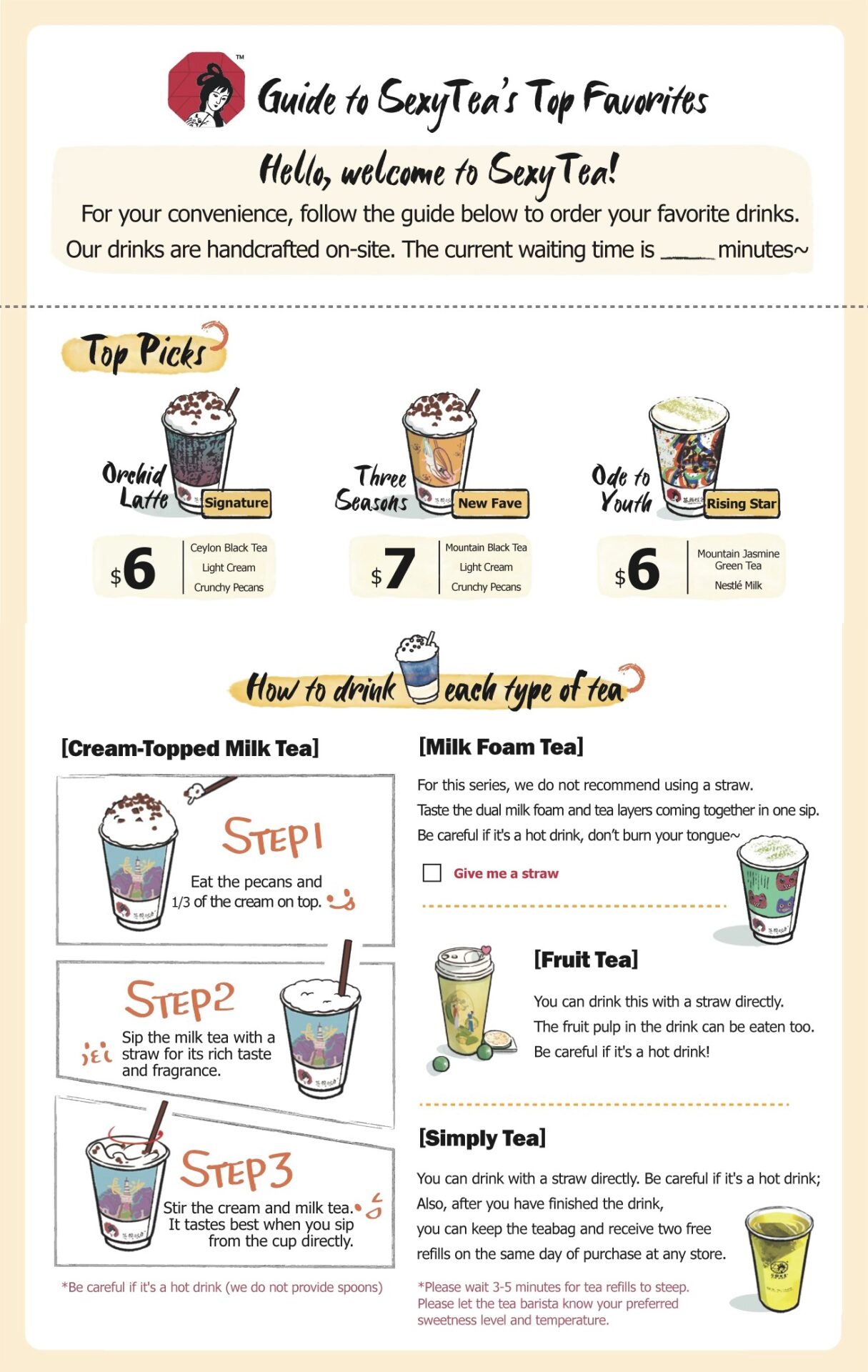
While working on the translations, the biggest dilemma I had was whether to keep SexyTea as the brand name in English, as it is the official English name that ChaYanYueSe has been using on its marketing materials. Although I ultimately decided to keep ‘SexyTea’ in the localized visual for now, I really do not think this name would be welcomed by most English-speaking consumers. If anything, it also does not do justice to the real meaning of the brand’s name in Chinese, nor does it align with the brand identity of emphasizing Chinese cultural elements and high-quality teas.
The brand name “ChaYanYueSe” (茶颜悦色) is a play on words of an existing 4-letter phrase, which means bringing bliss through appearance and beauty. It also incorporates the word “Cha” (茶), which means tea in Chinese. I think this is a beautiful and fitting name for a bubble tea brand, and I want to retain at least some elements of that.
One translation that I am rather happy with is “enCHAnted Tea”, perhaps. It means that we will be enamored with these bubble tea creations, feeling bliss. It also retains the word play of “Cha” in the word. I know it’s not perfect, but won’t you at least say it’s a step-up from SexyTea?
Hiding Text from Artwork (Photoshop)
My next task was to remove all the existing text from the visual, while retaining its artwork elements. Working in Photoshop, I saw that most of the text was situated over a white or solid-color background, which I could use the Fill function on easily.
For the brush-stroke text on the watercolor background, I had to be more careful to retain the yellow watercolor effects. Using the magic wand, I selected only the black text (and expanding that by 2 pixels); before activating the content aware fill function. This worked pretty well to imitate the watercolor background, but there were some gaps. I restored those by using the healing brush tool to sample the existing pixels and clone them over the gaps. Lastly, I smoothened the rough edges using the blur tool.
The following two GIFs show the process and final result.
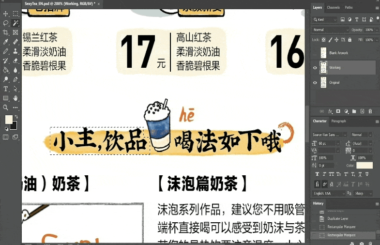
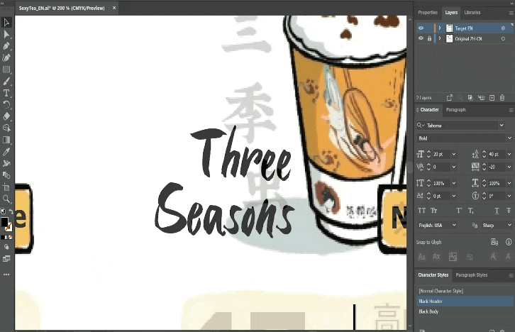
Adjust Text Treatment & Layout (Illustrator)
The visual was then ready for me to insert the English translations. I switched over to Illustrator, which allows me to have greater control over text manipulation. Using the original source image as an overlay layer set at 80% transparency, I was able to have a visual guide of the placement and formatting of all the text.
After creating text boxes and inserting the translations in all of them, I tried to keep to the approximate font size and spacing of the original. I also had to deal with text expansion issues, which is common in Chinese-to-English translation, as some of the text had to fit in limited shapes. On most of the occasions, I could get the text to fit by adjusting the font size, kerning, tracking and leading. However, on 2 occasions, I had to go back to the translations and reduce the number of words. This would mimic a real-life scenario where the DTP team has to request from translators for a shorter string for an existing translation.
One more thing that I had fun with was manipulating the text treatment manually, which is something I could do in Illustrator. I converted the text to an object, and edited the path using anchor points. In this GIF below, you’ll see the process I took to reshape a capital ‘L’ – as I felt the existing letter in the font looked rather out of place. I removed part of the shape, and tried to replicate the brush stroke edges on the end of the letter.
Result and Final Thoughts
With that, I was done with localizing this bubble tea visual, and I think I’m quite happy with it. I would say it wouldn’t look out of place on a social media page or as a printed brochure for customers in an English-speaking market. There were multiple aspects of localization that this involved, including pre-translation prep, DTP, and translation. I also picked up new skills using functions in both Photoshop and Illustrator. This was a great localization project, and I’m thinking about the next thing I might work on. Maybe a game or movie poster?
Watch a 1-minute summary of this project below.
Note: The original asset is widely available on the web, and can be accessed from ChaYanYueSe’s Weibo page. This project, video and blog post is a proof of concept and does not represent the brand in any form or manner.